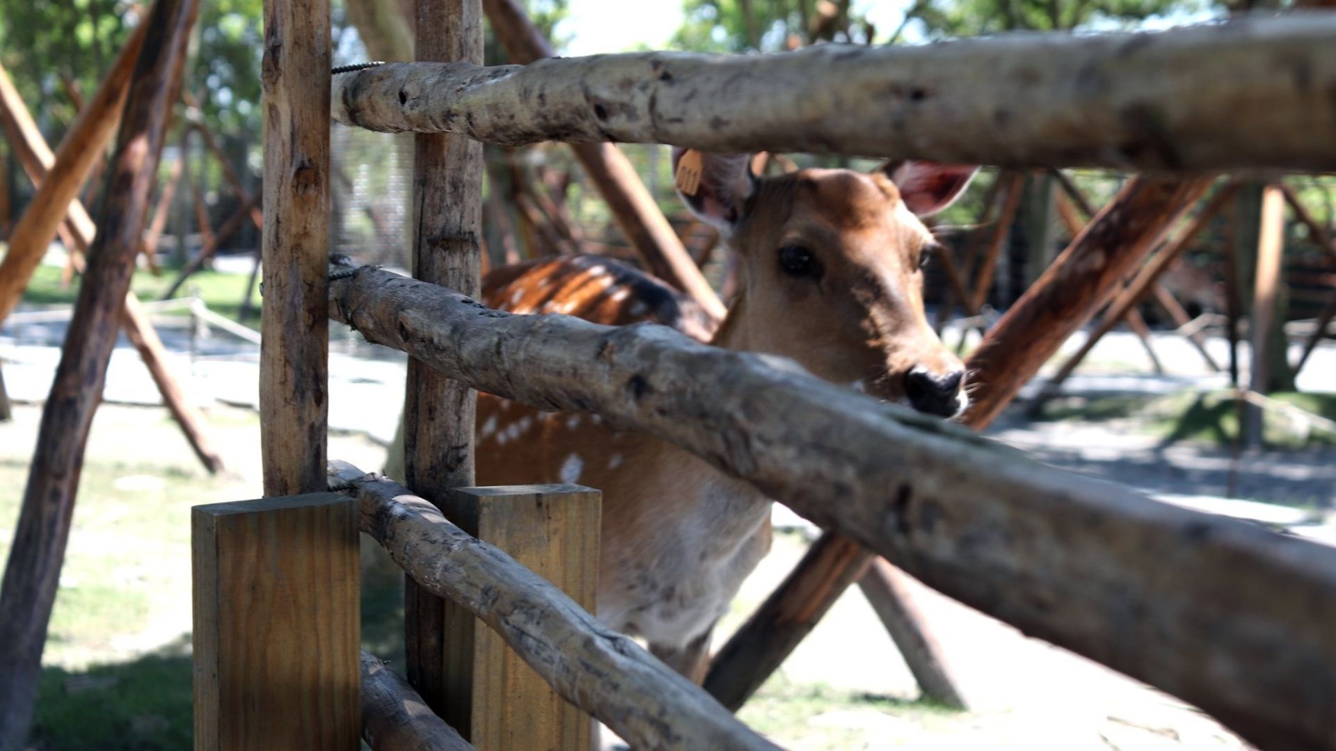
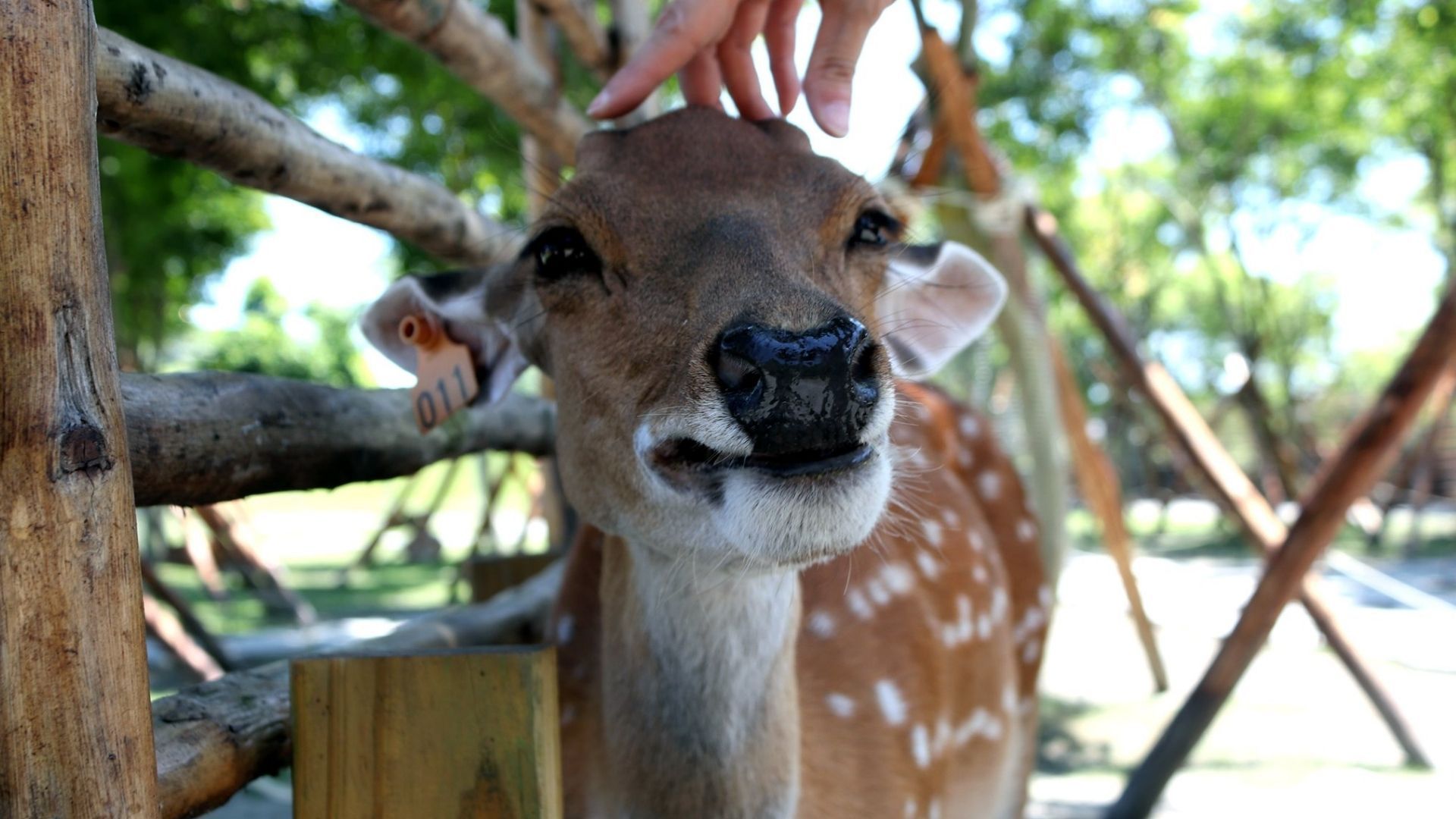
斑比山丘 Bambi Land
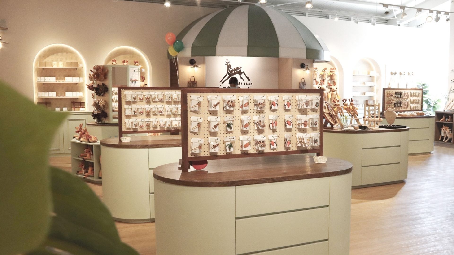
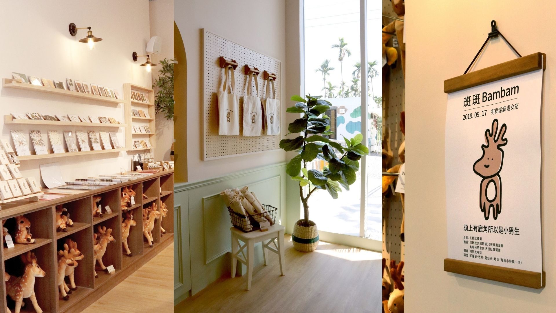
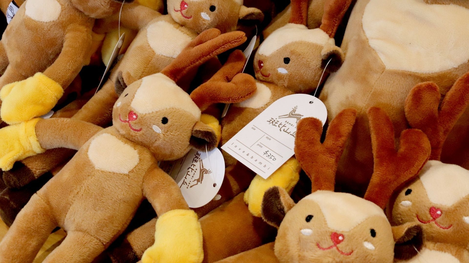
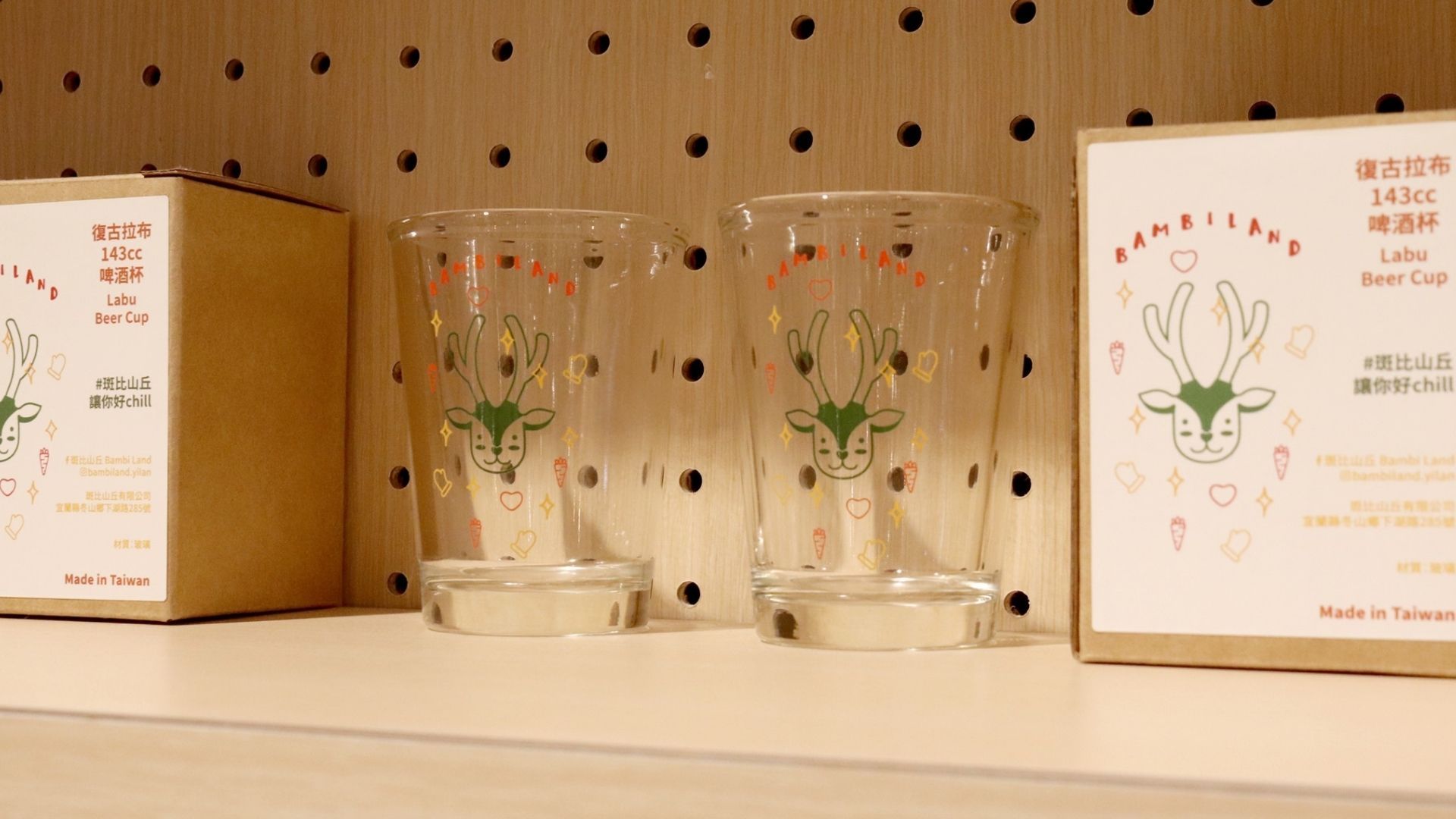
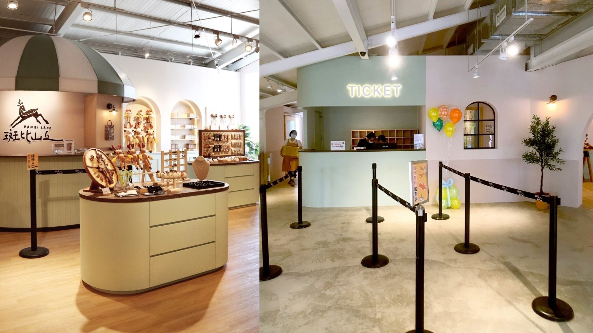
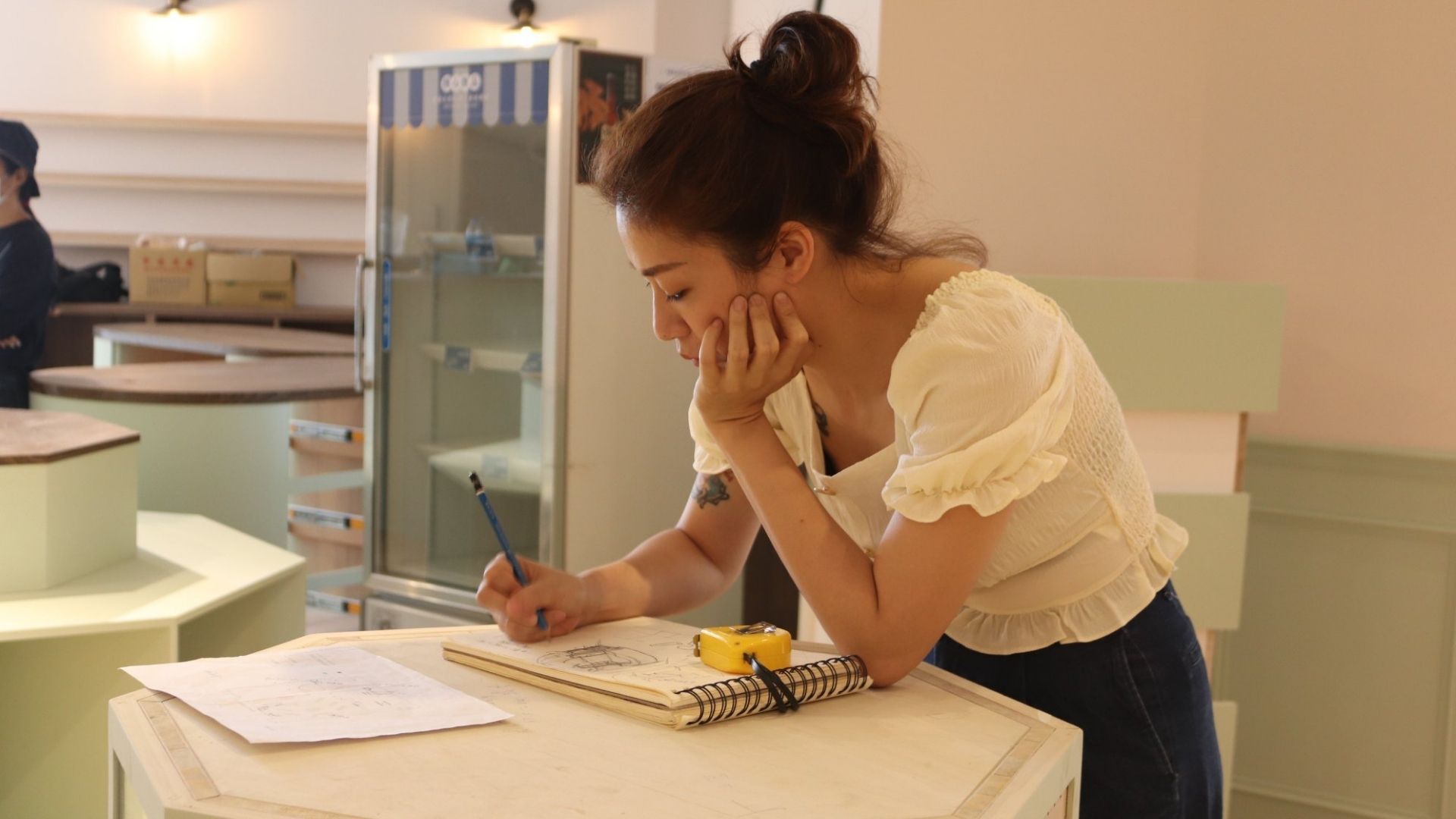
Brand identity, product planning, prop design, set design, and display arrangement are the key focuses of this project. Following the Bambi Land brand CIS guidelines, pastel tones from the brand's standard palette were selected, incorporating materials such as wood and kraft paper.
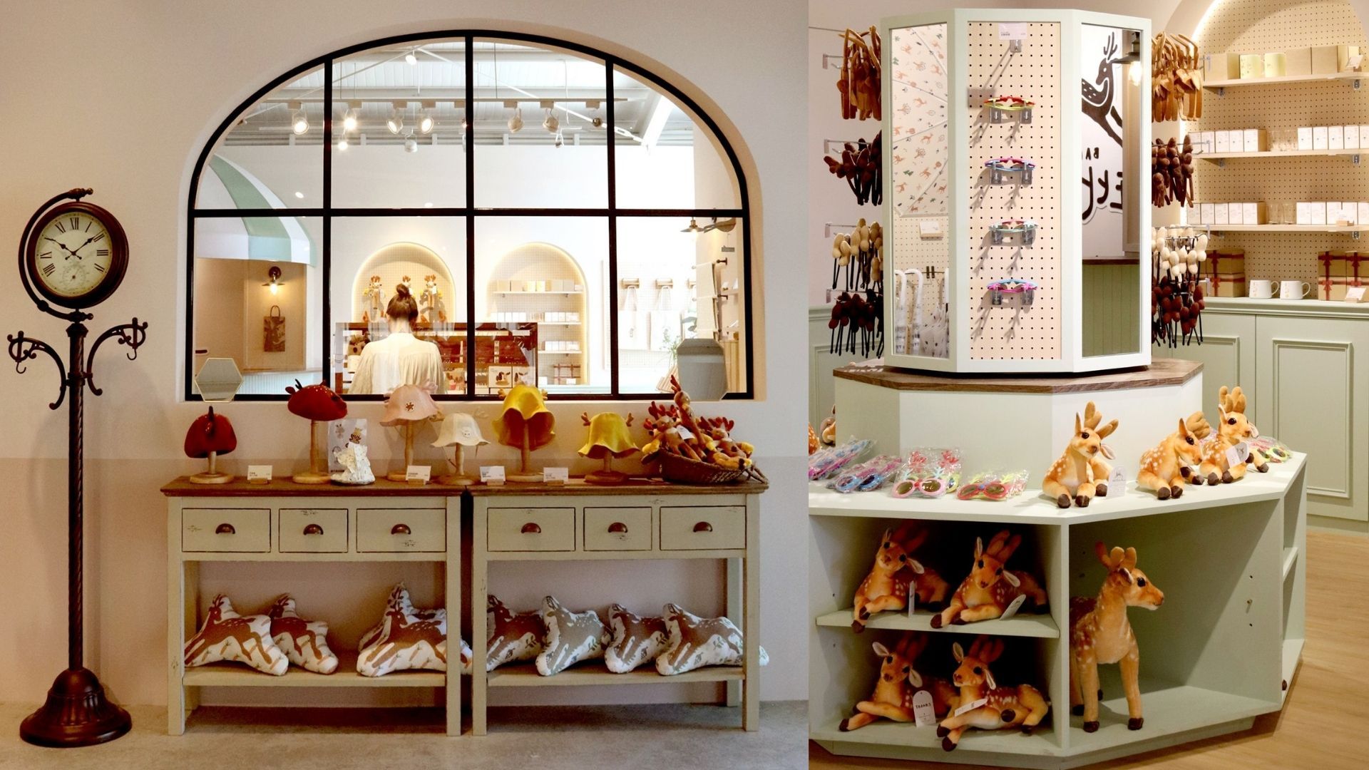
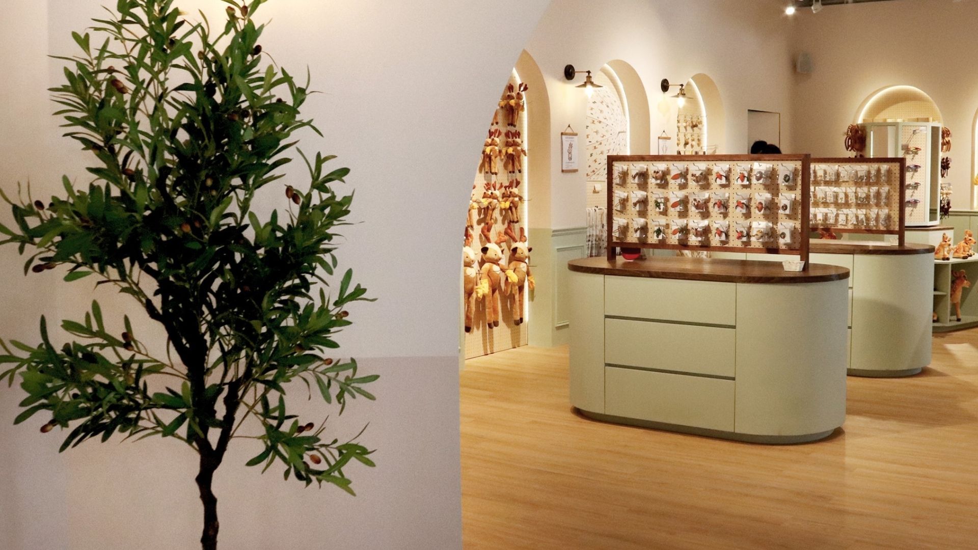
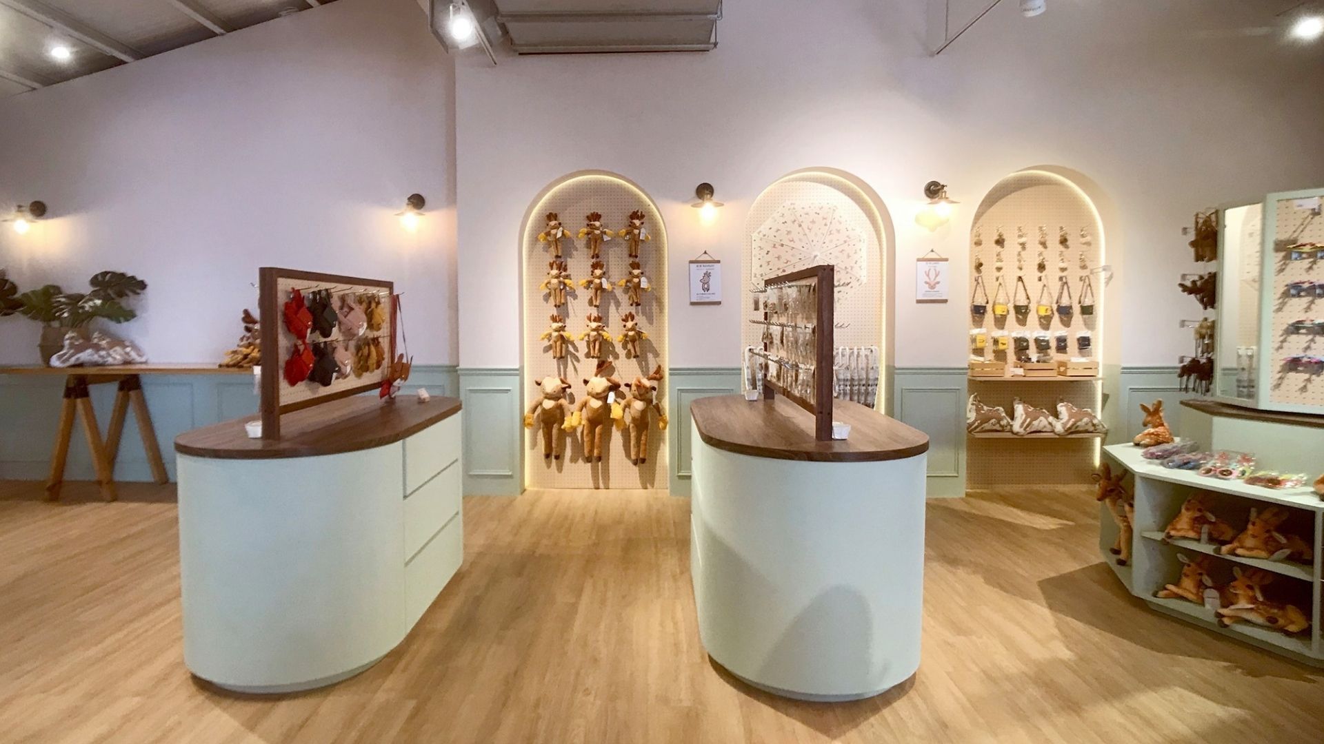
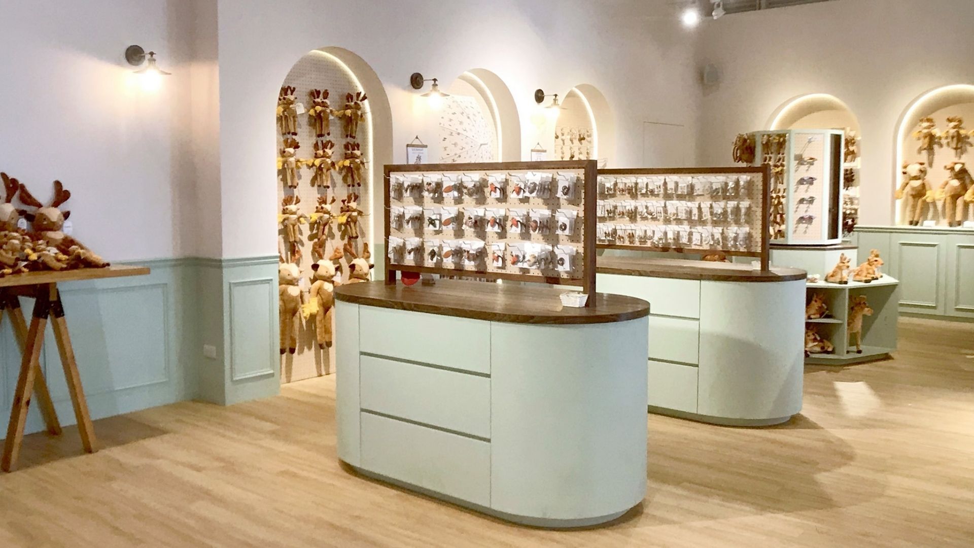
With the original concept of an amusement park, the design features custom display furniture and develops the brand colors into the interior color scheme and material specifications. To showcase the brand's meticulously crafted image, the store design extends into the product displays, more consistently conveying the youthful and energetic feel of Bambi Land.
品牌形象、商品規劃、道具設計、場景設計、陳列佈置,為本專案設計重點:依照斑比山丘品牌CIS的指示導引,選用品牌標準色中的粉嫩色系,如木料、牛皮紙的材質。
這次的設計以樂園為初衷,訂製了陳列傢俱並將品牌色發展為室內色彩配置及材質上的設定。 為了顯示品牌細心經營的形象,店舖設計延伸到商品陳列,更加一貫地傳遞班比山丘青春與活力的感覺。
Client / Bambi Land, 空間設計 / 棲仙陳列選物所, 攝影 / 王筑